
The Challenge
Returning homepage visitors were met with a completely generic experience that had no memory of their prior browsing, causing fragile re-entry intent to drop off.
Role - End-to-end product strategy, experience architecture, mobile-first launch strategy, category usability testing, and cross-surface ordering logic.
Team - 1 Senior Designer (Me), 1 Product Manager, 1 Content Designer, 1 UX Researcher, Engineering, Data Science.
Timeline - 3 Months (Discovery through Launch and Engineering Handoff).
The Strategy
Group a user's recent browsing habits into clear category cards on the homepage, allowing returning customers to instantly pick up where they left off without cluttering the screen.
The Outcome
$43M
12%
+12%
14%
In Revenue
Engagement
AOV Growth
Increase in Session Continuation
The Problem
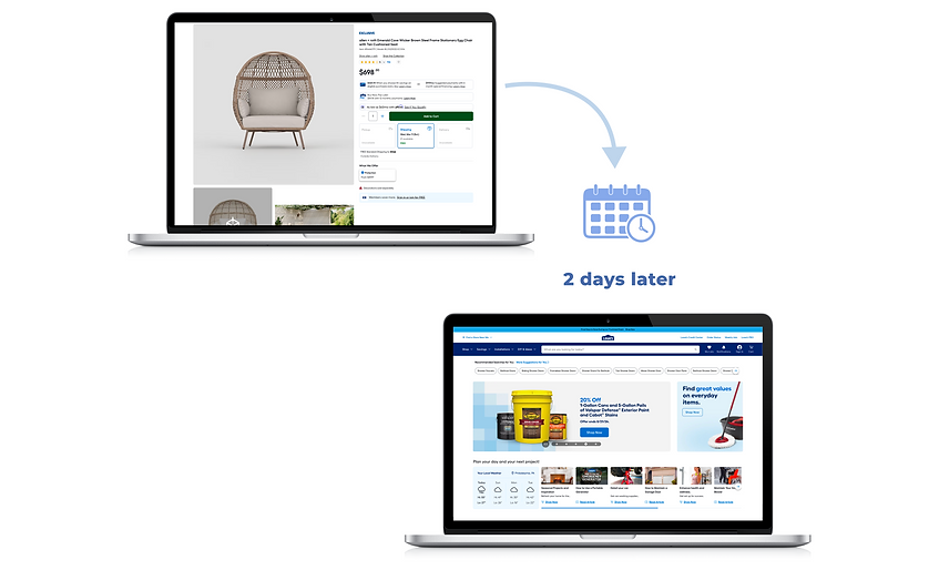
Customers frequently browsed high-consideration categories, grills, outdoor furniture, appliances and then left to compare options, measure spaces, or discuss with others.
When they returned hours or days later, they were met with a generic homepage. No acknowledgment of prior behavior. No shortcut back to active consideration.
This forced customers to:
-
Restart research from scratch
-
Re-navigate categories they had already explored
-
Rebuild context they had previously established
The friction wasn’t during exploration.
It happened at re-entry, when intent was already fragile.

Design Challenge
The challenge wasn’t simply surfacing recommendations. It was restoring momentum without feeling intrusive.
We needed to:
-
Recognize intent without over-personalizing.
-
Group behavior into meaningful entry points.
-
Integrate into an already dense homepage.
-
Operate within strict component governance.
-
Scale across mobile and desktop.
This was less about selling something new, and more about helping customers resume what they had already started.
Phase 1
Behavior Mapping & Strategy
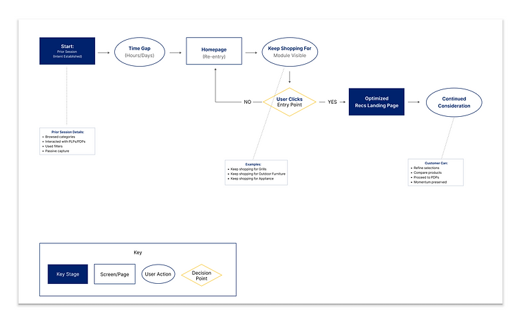
The Strategy: Identify high-consideration behavioral signals to group prior user intent into intuitive category clusters rather than single product repetitions.
We began by defining what qualified as active consideration, not casual browsing.
Signals included:
-
Repeated PLP engagement
-
Filter refinement
-
Multiple PDP visits within a category
-
Recommendation interactions
These signals were grouped into intuitive, category-based clusters, not individual products.
This avoided overfitting personalization and instead restored context.
.png)
.png)
Phase 2
Adapting to Platform Constraints
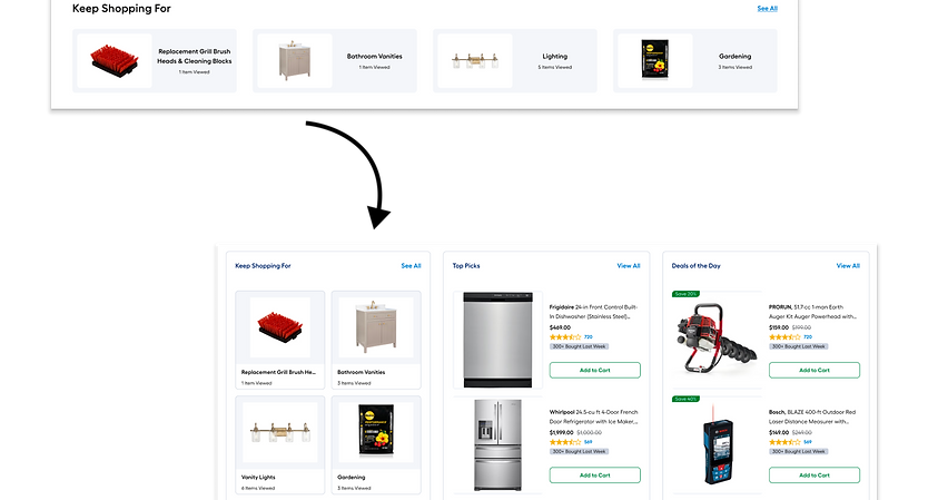
The Strategy: Transitioning the concept into a restricted 4-card grid layout to comply with strict homepage component governance.
Our initial "North Star" vision for this experience involved a rich, fluid horizontal container placed prominently at the top of the homepage. However, enterprise design realities mean working around fixed digital real estate boundaries.
Lowe's strict homepage component governance required our new feature to adapt perfectly into a standardized, restricted 4-card grid block layout. I navigated these layout constraints by completely prioritizing labeling clarity and clean typography over structural novelty. This structural adaptation protected the project from technical bottlenecks and prevented massive delivery delays with engineering, proving that great UX thrives within real-world guardrails.
.png)

Phase 3
Mobile Launch & Landing Page Optimization
The Strategy: Deploying a mobile-first launch strategy and optimizing the existing landing page infrastructure to accelerate time-to-validation.
We made a deliberate, strategic decision to launch mobile-first. This allowed our cross-functional team to test and validate the core interaction loops inside a tightly controlled, single-column viewport layout before scaling out desktop screen configurations.
Furthermore, I knew that clicking a homepage card was only half the journey. To maximize conversion once a user interacted with a card, I re-architected the layout of our existing recommendations page into a dedicated, high-context re-entry landing page surface. This gave users perfect visual continuity after clicking, while keeping the overall engineering scope incredibly lean by optimizing existing codebases instead of building a net-new page from scratch.

Tradeoffs & Delivery
What This Taught Me
The Tradeoffs: Adapting to a restricted 4-card grid reduced our initial visual prominence, but it enabled a faster launch within strict homepage component governance constraints. Additionally, optimizing our existing Recommendations landing page instead of building a net-new surface limited custom layouts but drastically shortened our time-to-validation.
The Delivery Strategy: We chose a mobile-first release to prioritize tight, controlled experimentation over cross-platform perfection, allowing us to gather performance data before scaling layout variants to desktop.
Continuity Is As Important As Discovery: True user retention requires restraint. Designing for a re-entry journey taught me how to recognize complex user intent without overfitting personalization algorithms.
Respecting Platform Realities: Strategic feature sequencing allows you to preserve your product ambition while respecting current design system boundaries.
More Case Studies


