Social Proof Platform
A behavioral signal system that surfaces real purchase activity at the moment of decision, reducing hesitation and accelerating conversion across digital and PRO surfaces.

MY ROLE
TEAM
TIMELINE
Senior Product Designer
Content Designer
Defined signal framework & priority waterfall
Designed PRO-specific experience
Led threshold calibration with Data Science
Drove concept through engineering handoff
Researcher
Product Manager
Engineering
Data Science
3 Months
1 Quarter
Discovery
Design & Testing
Engineering Handoff
The Outcome
$144M
In Revenue
2
Surfaces Shipped
3-Tier
Signal Waterfall
PRO
Specific Experience
The Problem
Shopping online lacks the ambient social context that makes in-store shopping feel safe. In a physical store, you see a product flying off the shelf, notice other shoppers with the same item in their cart, feel the energy of a product other people are choosing. That social proof shapes purchase confidence in ways most shoppers don't consciously register.
On a product detail page that context is completely absent. A customer looks at a tile, a faucet, a power tool and has no idea whether other people are buying it, ignoring it, or returning it. That uncertainty is a silent conversion killer, especially for higher consideration purchases where customers are already second-guessing themselves.
The question we set out to answer was straightforward: could we bring the social energy of in-store shopping into the digital experience by surfacing real behavioral signals from real customers, in real time, at the moment of decision?

The Design Challenge
The core challenge was building a system that felt authentic rather than manufactured. Customers are sophisticated. They've seen fake countdown timers and inflated inventory warnings on discount sites. Any social proof that felt gimmicky or untrustworthy would backfire, eroding confidence rather than building it.
That meant the challenge wasn't just about what the messages looked like. It was about the integrity of the signal behind them. Every message had to be earned by real customer behavior crossing a real threshold, and the thresholds had to be set carefully enough that the numbers felt meaningful without being manipulative.
We were also designing for two surfaces simultaneously, digital PDPs and a PRO-specific experience, each with different customer contexts and different definitions of what a compelling number looked like.
Strategy & Planning
Our strategic framing was simple: social proof only works when it's true, specific, and timely. A vague message like "popular item" does nothing. A specific message like "312 ordered last week" does something very different to a customer's decision-making. It makes the behavior of other people legible, and in doing so it reduces the perceived risk of the purchase.
Priority Waterfall Design
The most important design decision was building a priority waterfall rather than a single message type. Working closely with the data science team, we established a three-tier logic that maximized both message power and product coverage:
-
Tier 1: Orders. 100+ orders in the past week triggers the strongest signal. Orders are the most credible behavioral signal because they represent committed intent, not curiosity.
-
Tier 2: Cart Adds. 100+ cart adds triggers a consideration signal. Cart adds communicate strong consideration even without a completed transaction.
-
Tier 3: Views. 200+ views triggers an interest signal. Views have the lowest signal strength but the highest product coverage, useful for long-tail items.
-
No threshold met: No message appears. Deliberately.
.png)
Testing & Validation
Traditional usability testing wasn't the primary validation mechanism for Social Proof. The nature of the system, behavioral signals driven by real transaction data, meant the most meaningful testing happened through iterative threshold calibration with the data science team.
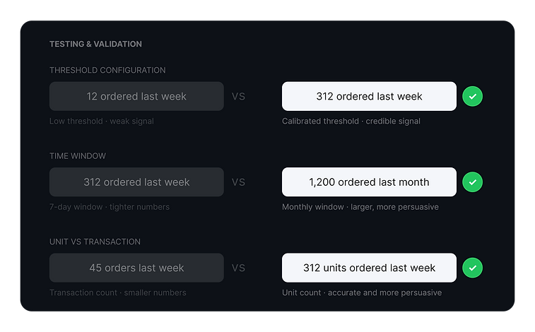
Threshold Configuration Testing
We tested multiple threshold configurations before landing on the final setup, measuring two variables against each other: catalog coverage percentage and the average number surfaced in the message. The goal was to find the configuration where enough products qualified to make the system meaningful, while the numbers shown were large enough to actually influence behavior.
Too low a threshold produced broad coverage but weak, unpersuasive numbers. Too high a threshold produced strong numbers but left most of the catalog without a signal entirely.
Time Window Iteration
We ran the same logic on time windows, testing seven day versus monthly windows by category. Shorter windows produced more recent, tighter numbers. Monthly windows produced larger figures but with less recency. We let conversion data settle the debate by category rather than applying a single rule across the board.
Unit vs. Transaction Testing
Shifting from transaction-level to unit-level counting was itself a hypothesis we tested. The question was whether larger numbers that were still accurate would outperform smaller but equally true numbers. They did, meaningfully.
The $144M in incremental revenue was the ultimate validation of the system design and calibration decisions.
The Experience
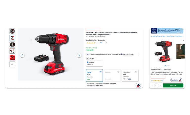
Digital PDP
Messages were placed on PDPs as the primary surface, positioned within the natural eyepath of a customer evaluating a product, informed by attention mapping and scroll depth data. Placement ensured the message appeared before the fold where it would be ignored. Mobile-first design included truncation logic for smaller viewports.
PRO-Specific Experience
A PRO-only version filtered the underlying data to show PRO customer behavior exclusively. A contractor shopping for materials doesn't want to know what a DIY homeowner ordered last week. They want to know what other contractors are buying. The PRO version used the same waterfall logic and threshold structure but drew from PRO transaction data, producing signals directly relevant to a professional buying context. Message language was also adapted to feel more peer-oriented.

Tradeoffs & Delivery
What This Taught Me
What We Deferred and Why
Not every signal we explored made it into the final system. We considered surfacing additional behavioral indicators, including return rates and wishlist activity, but deprioritized them in favor of signals that were unambiguous and immediately credible. Return rates introduced interpretive risk: a high return rate could signal high demand or high dissatisfaction, and we couldn't control how a customer would read it.
We also considered expanding Social Proof to category pages and search results earlier in the journey. That expansion was deferred to validate the core PDP behavior first before investing in upstream placement.
What We Gave Up
Limiting to PDP meant customers earlier in their journey, browsing categories or searching, didn't benefit from social signals in the first release.
Why It Was the Right Call
Validating the core placement first gave us clean data on what the signal system could do before expanding scope. It also kept the system fast to ship and easy to measure.
The most important thing this project taught me is that data-driven design isn't just about accuracy. It's about legibility. A signal can be completely true and still fail to persuade if customers can't quickly understand what it means or why it matters. The difference between "popular item" and "312 ordered last week" isn't just specificity. It's the difference between a claim and evidence.
It also reinforced that restraint is a design decision. Choosing not to show a message when the signal wasn't strong enough was one of the most important calls we made. The absence of social proof on low-signal items protected the credibility of the system everywhere else.
More Projects

Keep Shopping For
Keep Shopping For is a personalized entry point for returning shoppers, grouping browsing history into intuitive categories so customers can quickly resume their journeys.

Visual Scout
A visual-first discovery system designed to translate instinct into intelligent recommendations. Visual Scout reimagined how customers discover visually driven products by allowing them to react to items and receive recommendations based on taste, not filters.

Shower Door Selector
The Shower Door Selection tool provides clear guidance and education, helping customers confidently choose the right size, style, and price for their space.